Public & Commercial Architecture
RED Concept Store — A cyberpunk-industrial flagship store for a young fashion brand
A flagship store concept that translates a fashion brand’s identity into an industrial, cyberpunk-style space, designed as both a retail outlet and a meeting place to be photographed and shared.
2024 · Concept · Retail · Public & Commercial Architecture
When a fashion shop becomes an urban gallery and a meeting place
RED Concept Store was conceived as a retail identity concept for a trendy clothing brand aimed at a young audience, such as secondary school and university students. The brief was not simply to fit out a shop, but to design a flagship store format that could be replicated in premier shopping centres (such as La Rinascente in Milan or Galeries Lafayette in Paris), serving as both a shop and a meeting place. For a generation that views shopping as a social experience, the space had to convey the brand’s identity whilst offering visually appealing environments — perfect for photographing and sharing on social media, evoking the feeling of stepping into a contemporary art gallery. The project was developed for an international invitation-only competition, “MET Retail Identity”, organised by Lima-Commerce on the Desall platform, and presented here under the brand name RED: the proposal by Barberio Colella Architetti received a special mention.
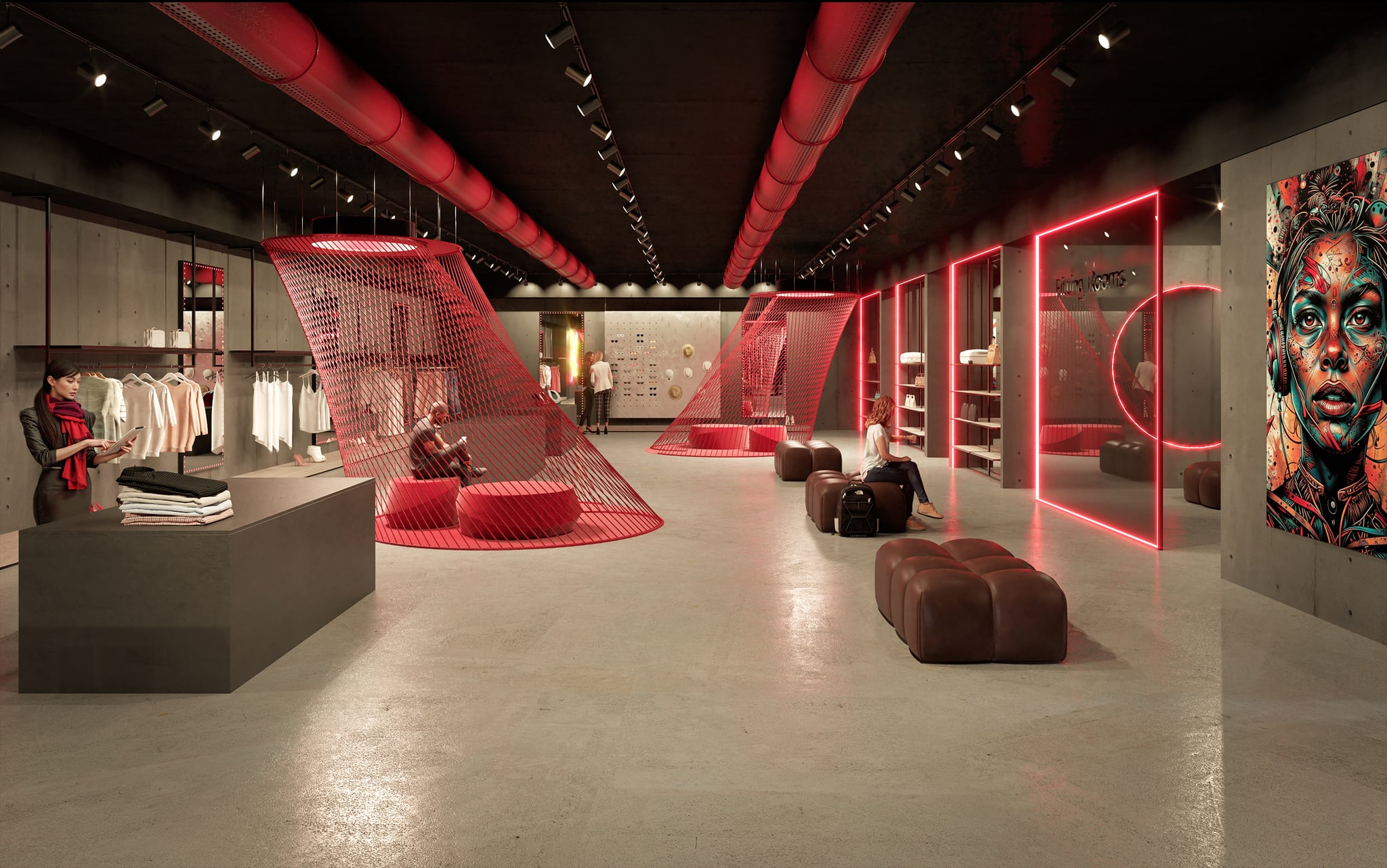
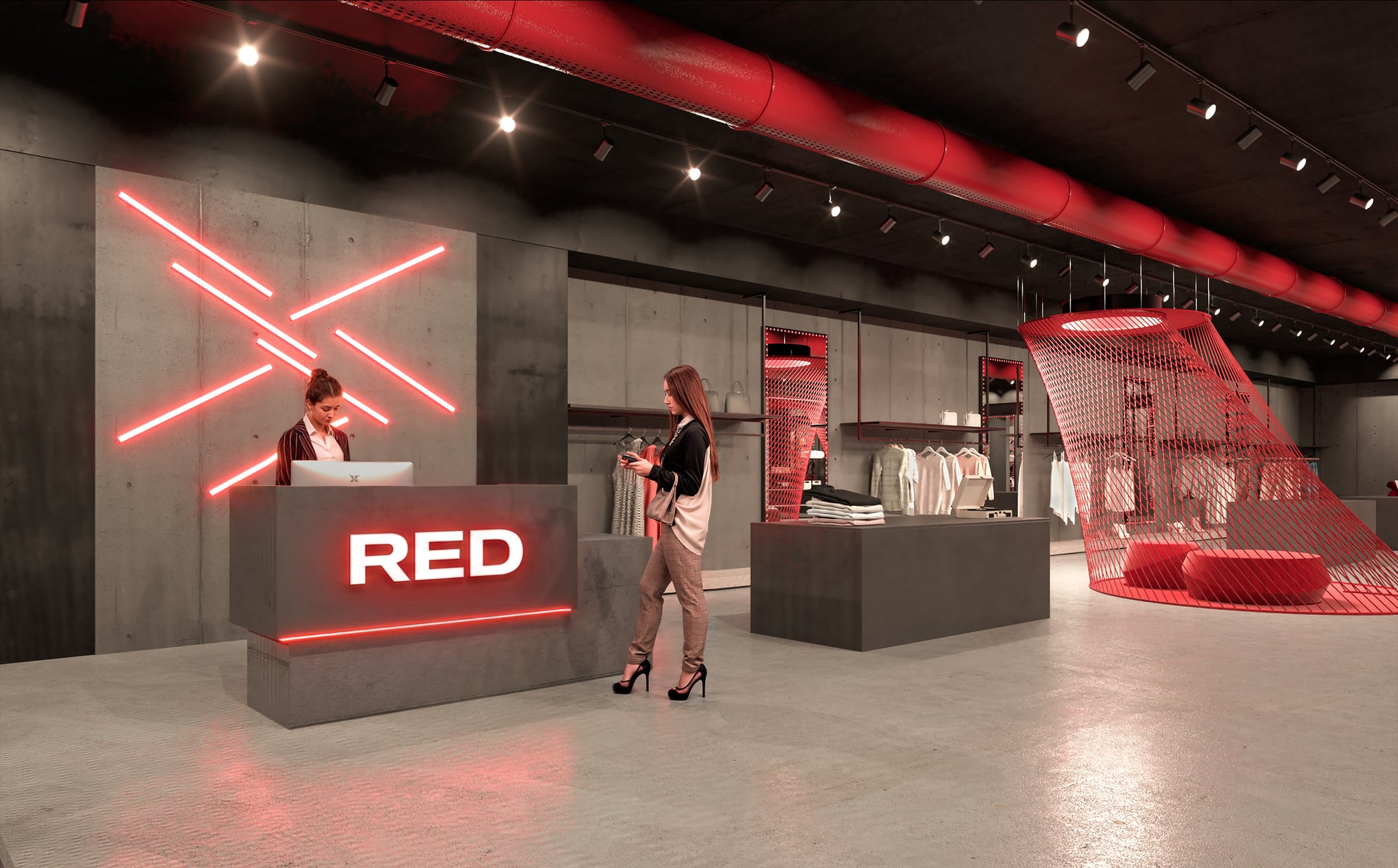
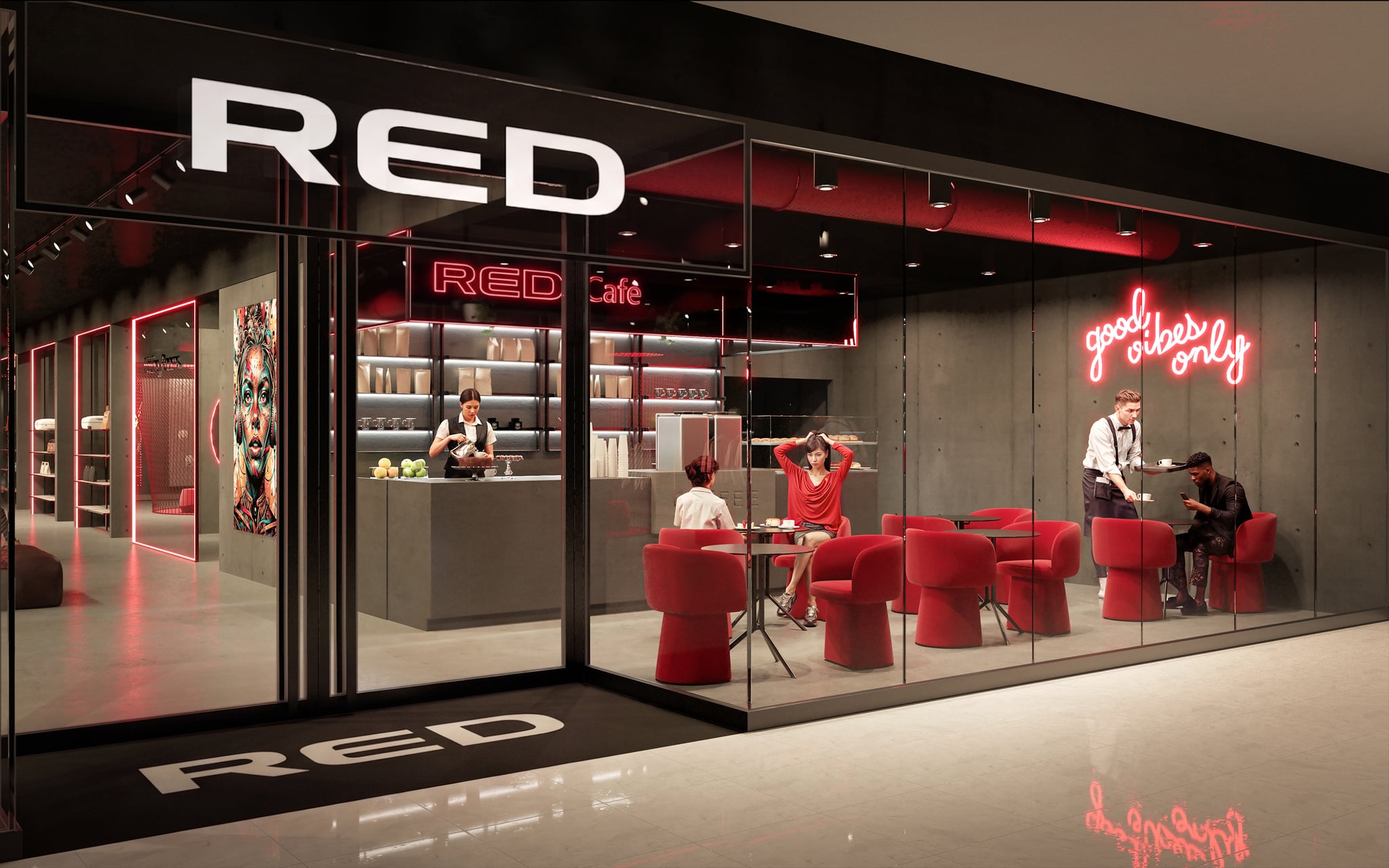
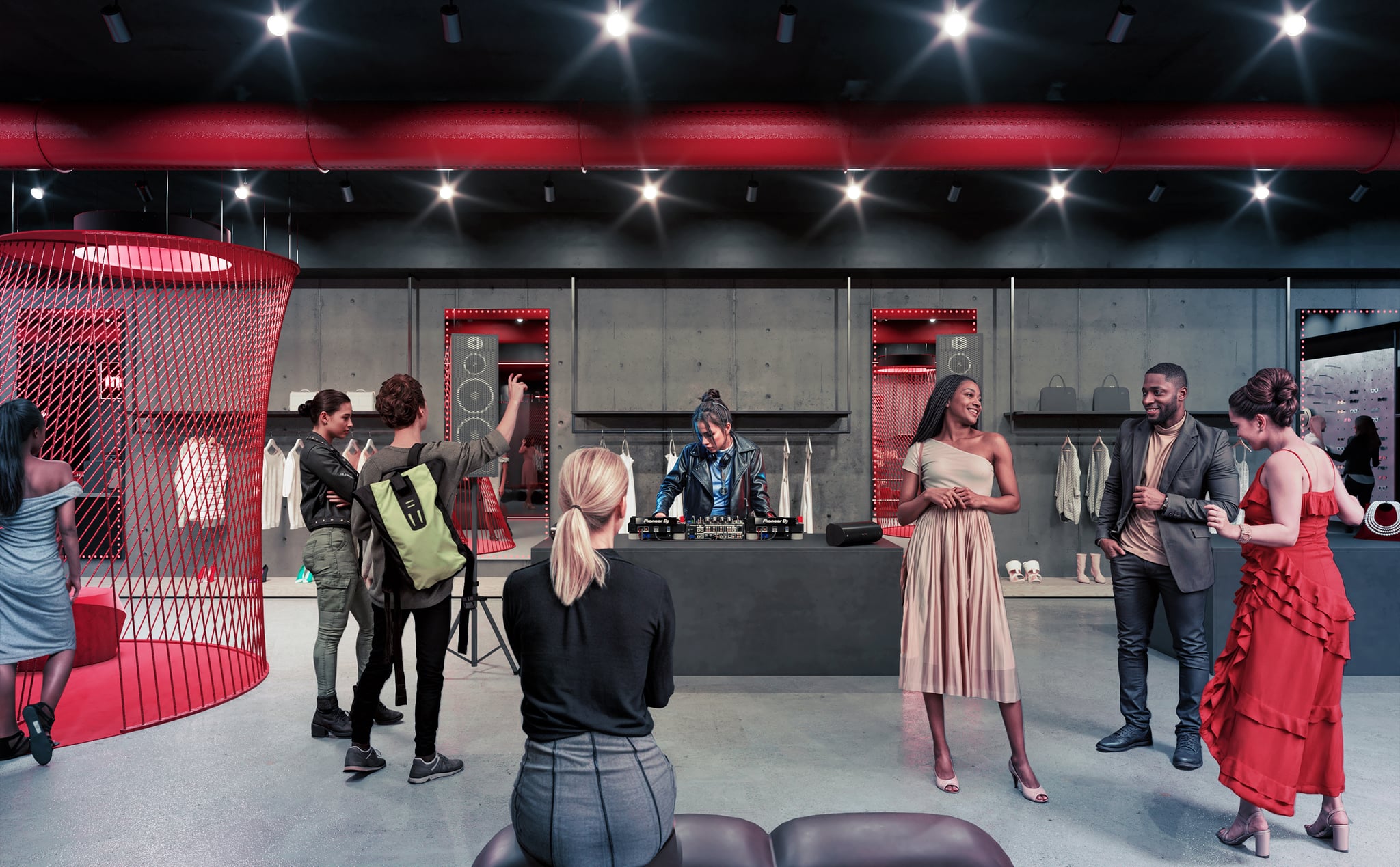
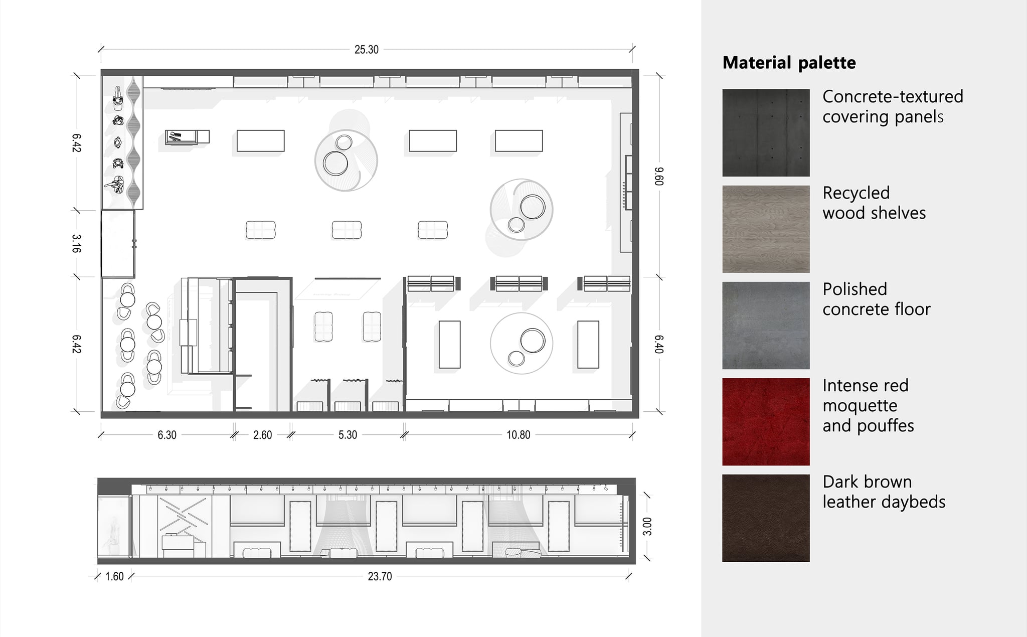
The strategy is based on a palette of raw, brutalist materials. Textured, concrete-effect panels cover all the walls; the floor is made of polished concrete; and the display units — both wall-mounted and freestanding — are made of metal and recycled timber: the result is an industrial, urban feel. Against this austere backdrop, bold red accents are introduced, giving the concept its name and becoming its recognisable signature: the perforated air ducts, the red LED lights on the mirrors, and the curved lounge areas. The brand’s identity, therefore, is not merely applied as decoration: it emerges from the atmosphere, the materials and the light.
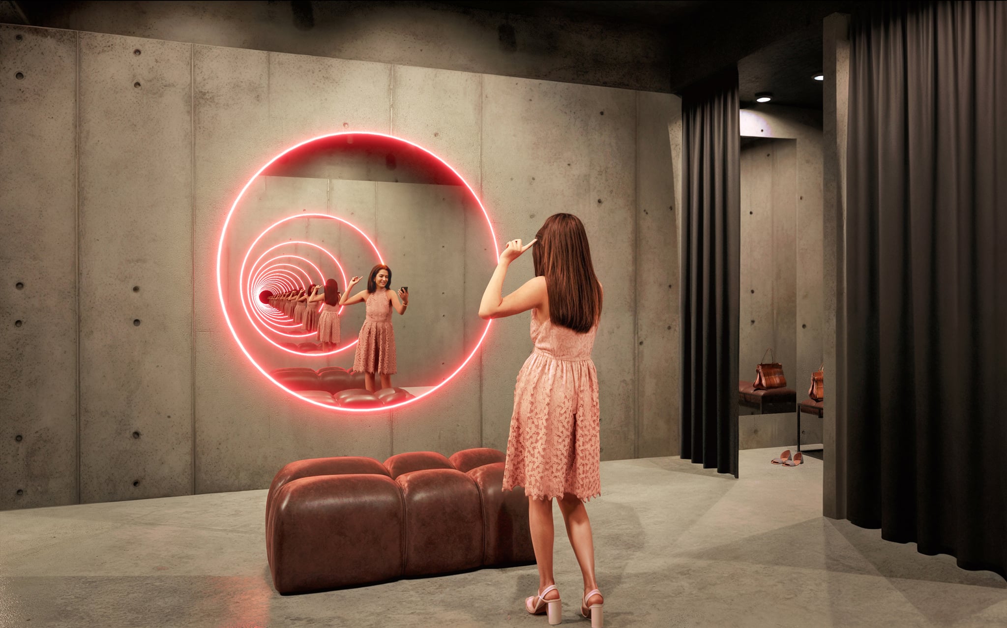
In practical terms, the sales area is a large open-plan space with display units along the perimeter and, in the centre, monolithic multifunctional units that organise garments and accessories and serve as a counter for staff. A second, more private area is dedicated to accessories, beauty products and perfumes, offering a more intimate shopping experience. The changing room area, separated by a smoked-glass wall, houses three cubicles with heavy black curtains and features the project’s most iconic element: two large round mirrors backlit in red, facing each other, which create the Droste effect – an infinite reflection, a sort of space-time portal perfect for selfies. The lounge areas, enclosed by curved surfaces formed by taut red threads and furnished with carpet and pouffes, add a contemporary and surprising touch.
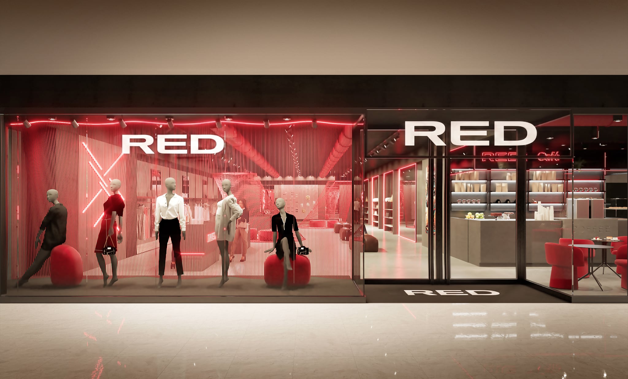
The entrance, situated on one of the short sides, is flanked by the shop window and the 60 m² café: the RED Café is visible from the outside and invites visitors to pop in, even just for a coffee, turning their visit into a social experience. The result is a coherent and replicable 400 m² format that demonstrates BCA’s approach to retail: interior architecture that builds brand recognition through the space itself, rather than through a logo repeated everywhere.

Technical specifications
- Year
- 2024
- Client
- Lima-Commerce
- Typology
- Retail — single-brand flagship store (interior design), replicable format
- Area
- ~400 m²
- Status
- Concept — Special Mention at the competition (2024)
- Designers
- Maurizio Barberio, Micaela Colella (Barberio Colella Architetti)
- Process
- “MET Retail Identity” international competition by invitation (Desall platform)
- Materials
- textured concrete-effect panels, shelves made from recycled timber, polished concrete floor, deep red carpet and pouffe, dark brown leather daybed, red taut wires (lounge)
- BCA vertical
- Public & Commercial Architecture + High-End Interiors
Trademark note: ‘MET’ is a trademark of its respective owners (a brand managed by Lima-Commerce). Barberio Colella Architetti is not affiliated with MET or Lima-Commerce, nor is it sponsored or endorsed by them. The concept, developed for the “MET Retail Identity” competition on Desall, is presented here — for trademark protection reasons — under the fictitious brand name “RED”. The images are project renderings for illustrative and professional portfolio purposes.
How do you transform a shop into a space that truly represents a brand, rather than just a simple display?
Anyone opening or refurbishing their shops finds themselves at a crossroads. On the one hand, there are shopfitters and visual merchandisers, who change the fittings and graphics but do not redesign the space; on the other, there are generalist design studios, which handle the technical aspects but deliver anonymous interiors, disconnected from the brand’s identity. For a fashion brand that appeals to a young, social media-savvy audience, the challenge is twofold: the shop must communicate the brand’s values and, at the same time, be a place worth photographing and sharing — not just a collection of shelves. What is needed is interior architecture specifically designed for retail: a concept rooted in the functional brief and the identity of the materials, where brand recognition stems from the space, the light and the details, not from a logo plastered everywhere.
Frequently Asked Questions
Are you rethinking your brand’s retail identity?
If your brand needs to design, refurbish or expand its retail outlets with a concept that translates its identity into physical space and turns a visit into an experience worth sharing, let’s have a chat. An initial video call is all it takes to assess your requirements, timelines and feasibility together.
Let’s talk about your projectWe’ll get back to you within 48 hours. No obligation.
Related projects
Public & Commercial Architecture
BRACCIALINI HQ
A perforated aluminium screen envelops the Florentine brand’s headquarters: high-performance solar shading, natural ventilation and a contemporary identity for a production facility that has become a landmark.
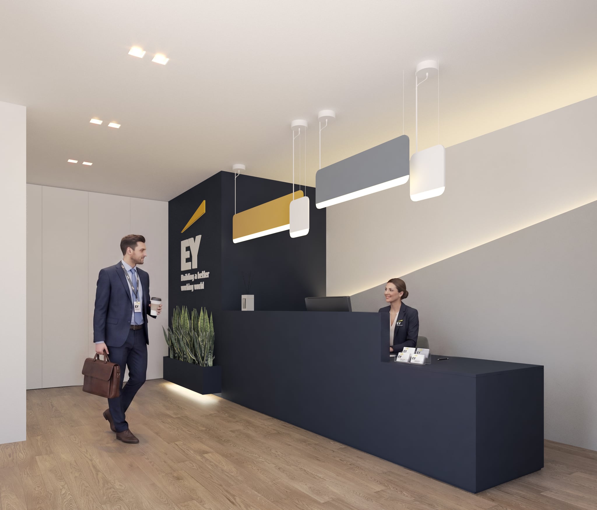
High-End Interiors
EY BARI
The comprehensive refurbishment of three floors, featuring a new dedicated entrance onto the street, transforms an office building into flexible workspaces that reflect the identity of a global brand.
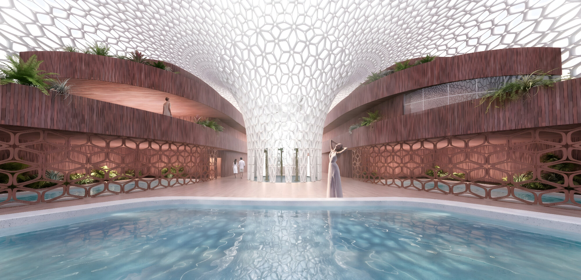
Public & Commercial Architecture
FOOD & WELLNESS CLUB
A building-organism dedicated to wellness in the heart of Bologna’s FICO agri-food hub: a parametric building envelope inspired by plant cells, a courtyard for passive ventilation, and timber interiors that evoke the city’s brickwork.